Suhrkamp’s ambition is to publish writers. However, contemporary writers are not only limiting their work to books but are also exploring other medias and formats. With Filmedition Suhrkamp the publisher responds to these new and interdisciplinary ways of creation, and launches its first series with the objective to publish cinematographic work.
We helped Suhrkamp create a visual identity and packaging design for this new DVD series, which fits the established corporate identity, and communicates the expansion of its business towards the cinematographic field.
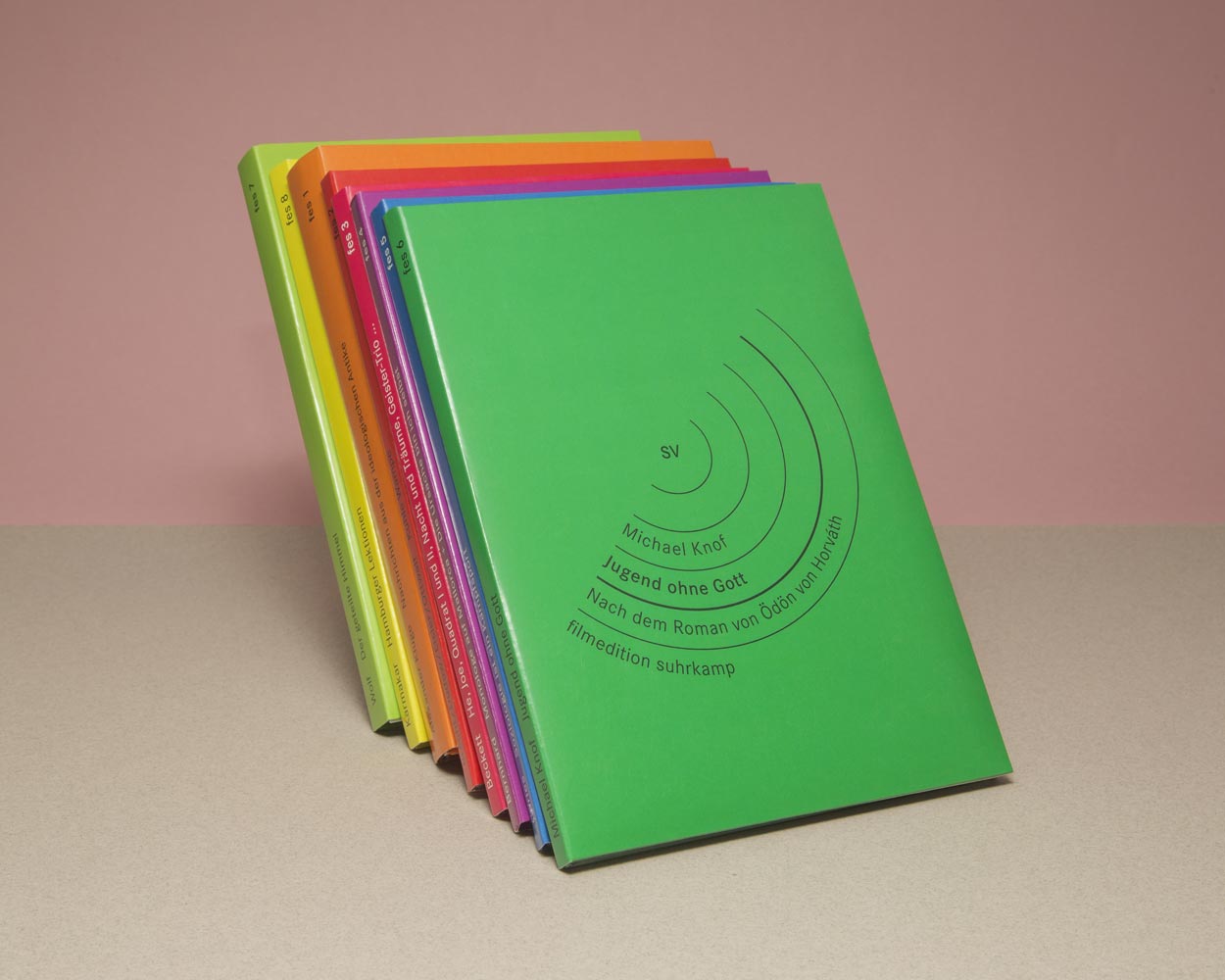
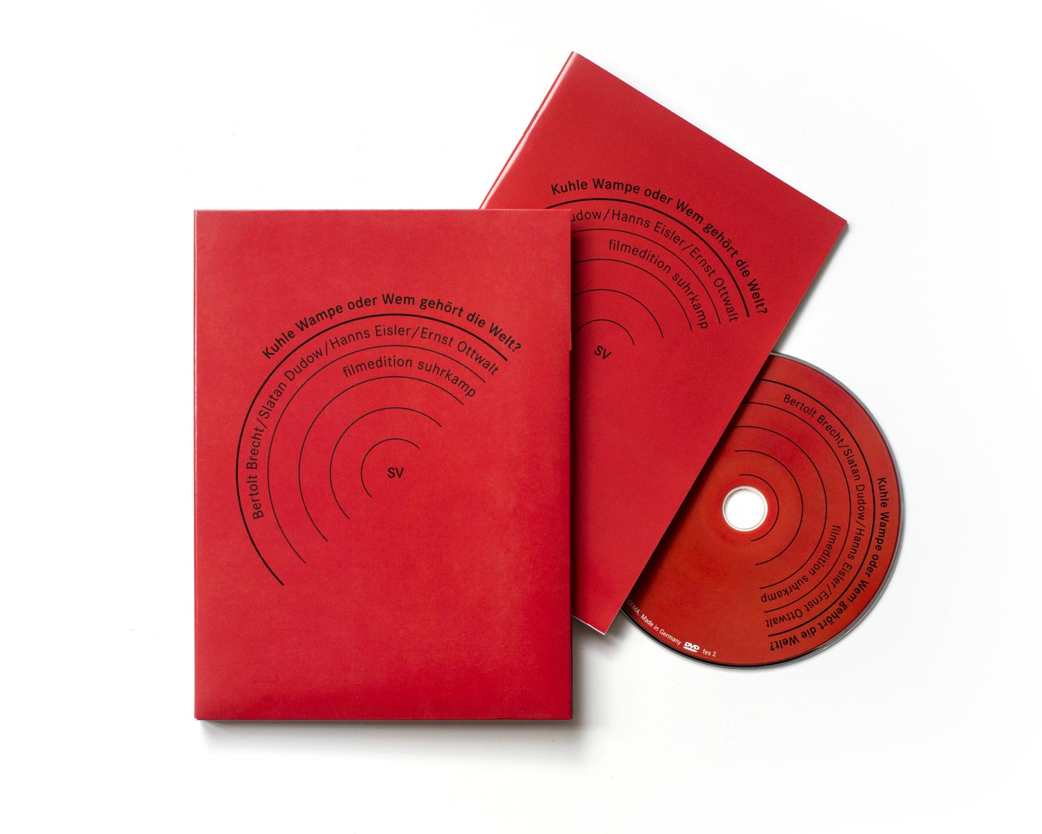
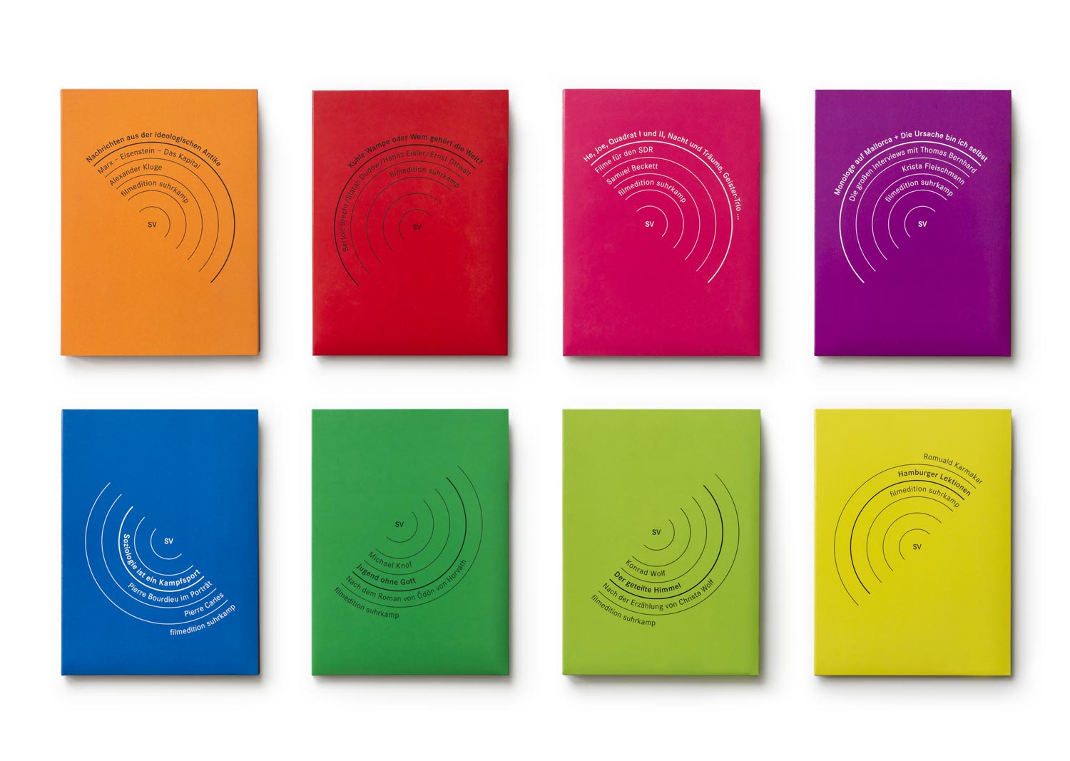
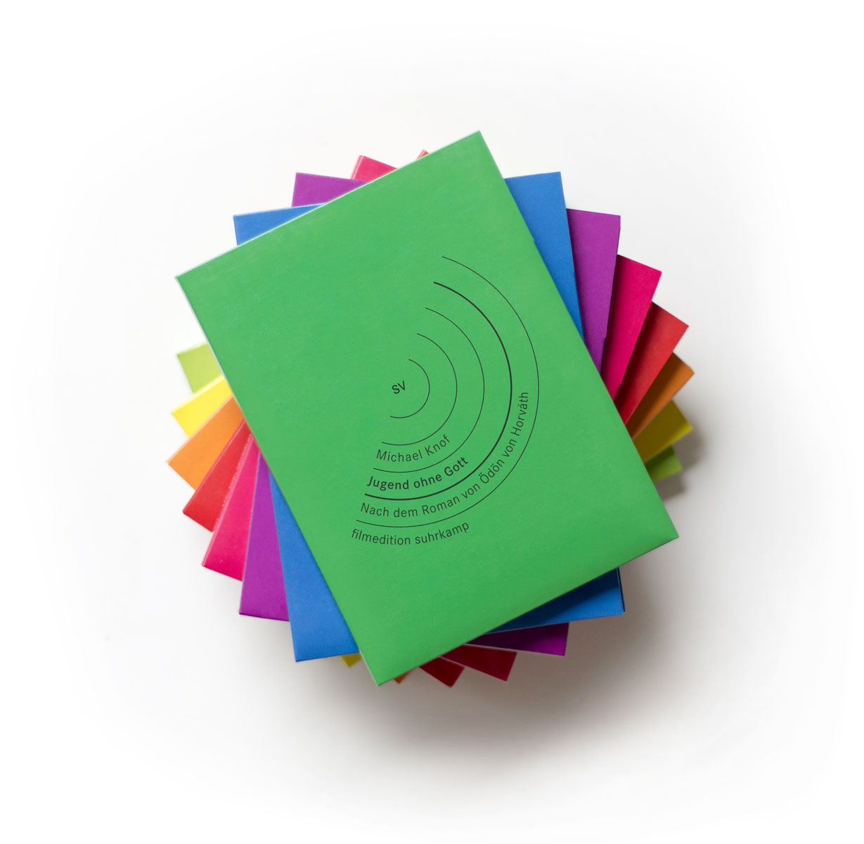
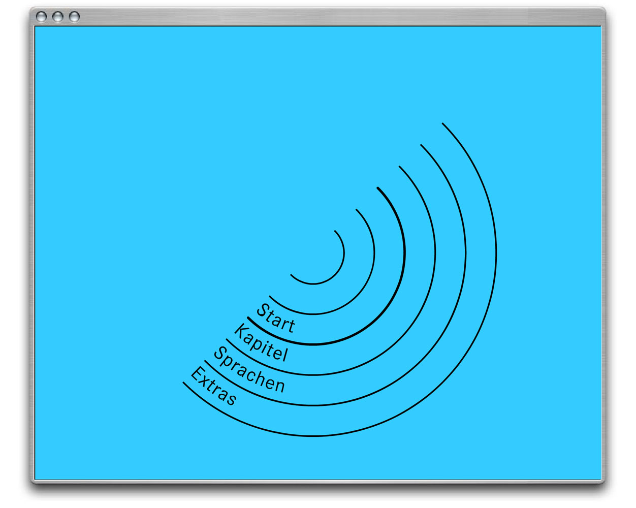
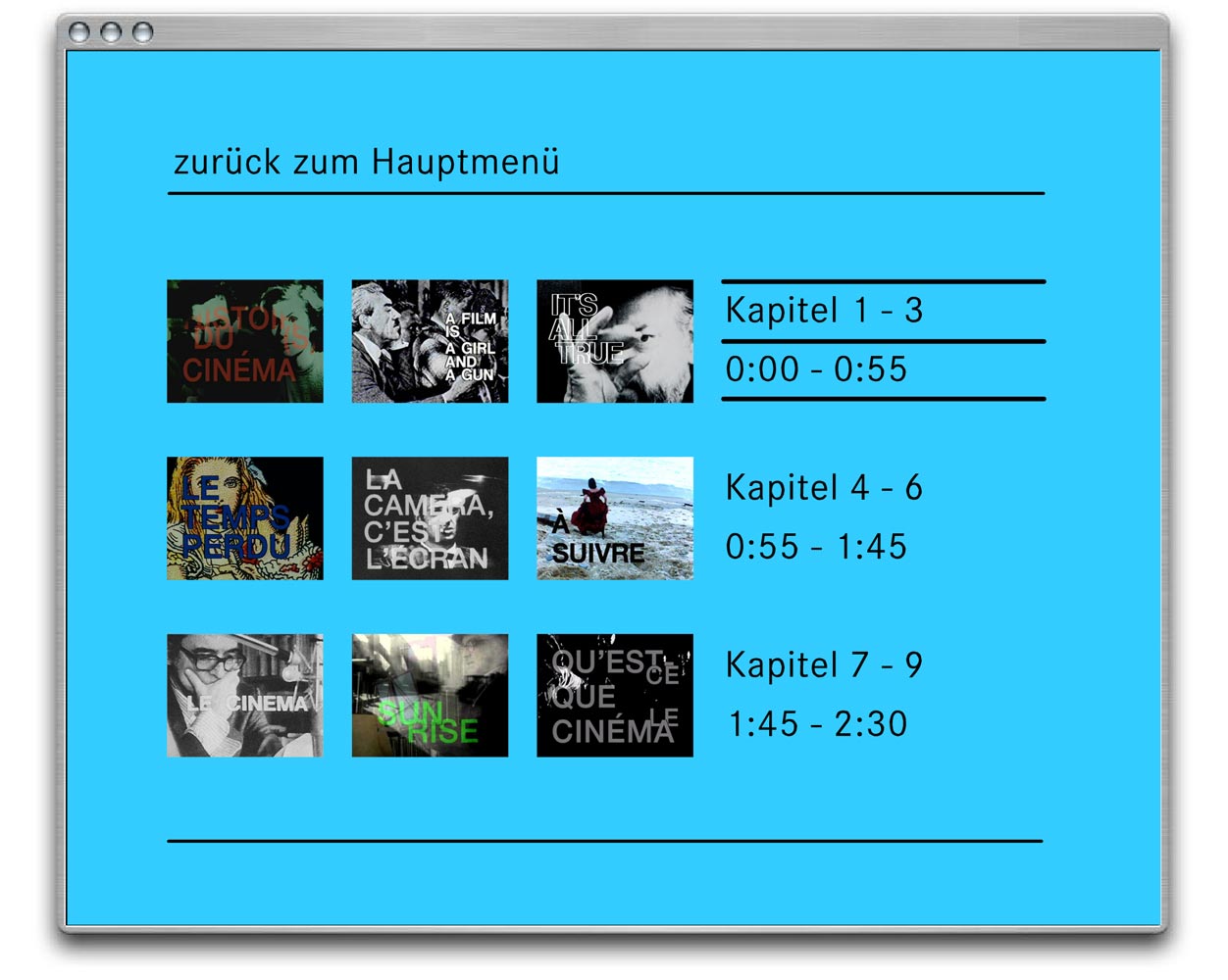
As its name indicates, Filmedition Suhrkamp is a close sibling of Edition Suhrkamp, an iconic series of books from the 1960s designed by Willy Fleckhaus. Therefore we used the identity of Edition Suhrkamp as a formal starting point for our new designs. When Edition Suhrkamp first launched, its design was revolutionary with its fresh rainbow colours and minimal typographic layout, which references the typographic grid and printing techniques. For the new Filmedition we maintained the rainbow-coloured approach and changed the typographic layout to follow a circular shape, which references the round DVD format and curved data sectors. As such the new design “does not simply mimic the celebrated template: it creates a parallel rainbow, for the medium of light, in dialogue with the predecessor.” (Typojanchi Catalogue)
Filmedition Suhrkamp was designed in collaboration with Alexander Stublic.
News: In 2013 the Filmedition was selected and presented at Typojanchi – Seoul International Typography Biennale. Visit Typojanchi
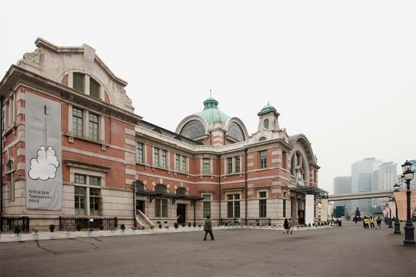
Courtesy: Typojanchi